New Additions: June 2018
24th July 2018
We add hundreds of fonts to the Identifont database every month. Most of these are recent releases, and some are simply new acquisitions from foundries who were not yet represented on our site. Stephen Coles gives his take on the most interesting recent additions.
![]()
![]()
A recent trends in type design is mining the late 19th century for idiosyncratic oldstyle faces that were previously considered too strange or awkward to fully revive. See Saol, Roslindale, and Untitled. Mackay is one example of this Victorian-inspired wave, drawing its exaggerated serifs (E, F, G, L, Ss, T) from Ronaldson of 1884, but the overall design is highly original. The extra large lowercase – a typical characteristic of René Bieder type – is a contemporary touch, as are the foxtail terminals (a, c, g, r, y).
![]()
![]()
![]()
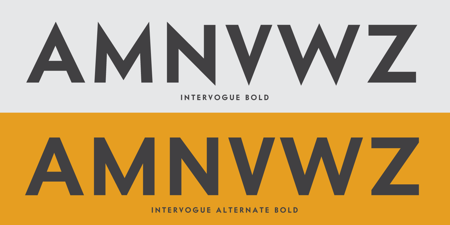
Speaking of digging up the past, Vogue is a 1930s geometric sans serif that I’ve longed to see available in digital form. Designed by Intertype for the fashion magazine of the same name, Vogue is clearly a Futura follower but has its own distinct personality: the ‘Q’ with centered tail, the long-barred ‘G’, the more symmetrical ‘S’ and ‘s’. Having missed the conversion boat from metal to photo type, this forgotten face finally sees the light again in Intervogue. It’s a respectable reconstruction as Richard Miller has maintained most of the original’s charm while rebalancing some of the off-kilter drafting, especially in the bold weights. Unfortunately, some of the most characteristic shapes were lost, such as the double-story ‘a’ and open-bowled ‘g’. Miller’s decisions make Intervogue more familiar (and perhaps more usable) but they bring his typeface even closer to Futura and give designers fewer reasons to try something new. I would have liked to see the original forms available as alternate glyphs at least. On the plus side, the “Alternate” fonts include the idiosyncratic ‘E’ and ‘F’ with long bars. There are also optional flat-apex caps for settings that call for a more straightforward approach.
![]()
![]()
![]()
![]()
With quaint curlicues and the subtle swelling of an inky pen, Hannes von Döhren’s Giulia is perfectly baked for sweet shops and dainty invitations. The Plain flavor offers swashless letters for less frilly occassions, and because all three weights come in both variants it’s possible to mix-and-match to taste.
![]()
![]()
![]()
![]()
![]()
After nearly a decade of experimenting with various typeface styles, Spanish designer Juanjo López truly found his voice (and a higher level of quality) in Xunga. The comical flair is unabashedly unique from the start, but the idea is advanced with the addition of two variations on the stress axis: “Top”- and “Bottom”-heavy variants let the user turn up the funk. Use them all together for maximum zaniness. Xunga’s brush-derived construction also allows for extreme proportions; the Ultra-Expanded is ridiculously wide, yet feels completely in character with the rest of the family.
![]()
![]()
![]()
Issued in 2007, National was well received, earning a Typographica selection and plenty of use. Designers of books, identities, and packaging appreciated the typeface’s ability to straddle formality and informality, Grotesque and Humanist. It was just the ticket for occasions where Helvetica was too straightlaced and ill-suited for text, but other contemporary sans serifs were too expressive. Despite its success, designer Kris Sowersby recently saw a need to completely redraw every letter. One can’t blame him: it was just his second typeface and he’s learned a lot in the ten years since its release. Sowersby’s honesty is admirable: “As a recent design graduate keenly interested in typography and typeface design, I was filled with an unflappable zeal. But I didn’t know nearly as much about design and typography as I thought I did.” The changes in National 2 are not immediately obvious, but that is by design. Everything just feels more balanced and less lumpy. Identifont’s Differences tool allows you to see some of the changes when comparing the Bold weights. Note the wider lettershapes in National 2, opening interior spaces and allowing for a more even range of weights throughout the family.