New Additions: April 2024
30th April 2024
From the hundreds of fonts we add to the Identifont database every month we chose a selection of the most interesting recent additions, and interviewed the designers about their approach to each design:
![]()
![]()
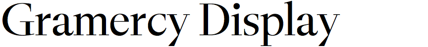
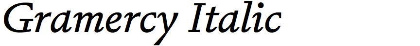
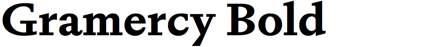
Robert Janes – Gramercy (Dinamo)
Gramercy is a striking serif typeface in three optical sizes: Standard, Fine, and Display. What prompted you to design it?
Personally I find designing original serif typefaces particularly challenging as their forms carry so much history and leave less room for experimentation compared to sans-serifs. A long term goal of mine was to develop something interesting within this very traditionally-charged genre, and Gramercy is the outcome of this year’s long endeavor.
Gramercy Standard was designed first, as my primary aim was to make a functional serif for text typesetting. Then later on we realised that the typeface’s sharp forms would look striking with higher contrast, so we drew the Display and Fine typefaces to expand the editorial flexibility of the typeface.
Dinamo’s description states that Gramercy was partly inspired by F.H. Ernst Schneidler’s italic typeface Amalthea; what influences are visible in Gramercy?
The rigid and dynamic construction of the Amalthea’s lowercase forms were a large influence on my initial italic drawings for Gramercy, which in turn informed the entire typeface’s DNA as I drew the Regular Italic before any other styles. Keeping this rigidity and sharpness was something I tried to do through favouring flare terminals over ball terminals and opting for square serifs. Amalthea’s ‘C’, ‘G’ and ‘S’ also feature very upright top terminals, which was something I carried over into some of Gramercy’s italic forms, I think giving the italics a sense of velocity and freedom.
Additionally Amalthea’s slightly wacky and calligraphic swash caps were my inspiration for adding an entire set to Gramercy. I drew them in a playful and free manner, not aiming for historical accuracy but to try something new without the constraints that traditional roman capitals carry.
I see some echoes of Georg Trump’s Trump Mediaeval in Gramercy, such as the forward-pointing ‘G’ serif, and the chiselled appearance. Was that also an influence on the design?
Trump Mediaeval was not something I was looking at during the design process, but being a huge fan of Trump’s work in general it definitely could’ve snuck in through my subconscious! Looking at it now there are quite a few resemblances.
I always like it when a typeface has an earmark that immediately identifies it from among other typefaces, and in Gramercy it’s the quirky centre junction of the ‘W’ (and ‘w’). Where did the inspiration for that come from?
This ‘W’ junction came from us experimenting with similar moments in other glyphs in which two strokes statically collide, such as in the apex of the ‘A’ or the junction in the ‘4’. We felt these sharp collisions accentuate the rough painterly feeling of these glyphs, and in this sense speak to the nature of Gramercy’s construction: it being an elegant typeface drawn with a crude logic.
![]()
![]()
![]()
![]()
Solenn Bordeau – Minorca (Black Foundry)
You’ve written that Minorca was inspired by lettering you saw in Port Mahon on the island of Minorca. Did you photograph the lettering, and what was your process for getting from the lettering to your typeface?
Yes, exactly. It all began during a walk on this stunning island. I have a habit of capturing intriguing street signs through photography, and one particular engraved plaque caught my attention. It was all composed in small capitals and had this rather condensed and bony look with its irregular and round serifs, giving it an unexpectedly alluring texture.
I first tried to digitise the letters by preserving their unique irregularities. I was really looking to have the same global texture. As I expanded the alphabet, starting with the capitals, certain characters like ‘M’, ‘W’, and ‘N’ stood out with their small extensions at the diagonal junctions.
Introducing lowercase letters, absent in my reference, required inventive adaptation from the capital's specific features, maintaining narrow proportions and strategic serif placements. Gradually, I expanded and refined my glyph set quite instinctively.
Minorca comes in five weights, and two variants: Regular and Wavy. Why did you decide to provide a Wavy variant?
It's actually a blend of inspirations that led me to add this Wavy axis. I was back in Brittany, where I come from, and I came across these Fishing Figures that are sometimes found on boats, but also a style that we find on cafe lettering or house signs on the north coast of Finistère. These characters evoke fishermen. For fun, I wanted to build upon the structure I was working on, which already had deep serifs, like bones, and add a marine ornament to it, like an unfurling wave.
The variable font format seemed like a good way to bridge these two designs. I wanted to explore a somewhat original application of a variable font axis, moving away from the more traditional axes of width and weight, and instead focusing on an axis aimed at adding an ornament to typography, allowing it to show itself in a different light.
When designing Minorca as a variable font was it difficult to get the waves to transform smoothly along the Wave axis?
This transition from the so-called Regular version with its rather round and soft serifs to a more defined and stretched form through the Wavy axis required several attempts at point placement, making it not so easy. The style starts from a typology of shape (Regular style) to move towards a form that becomes sharper at the ends (Wavy style), which demands some consideration in shaping. The movement between the two sources was left untouched; I decided to let the wave created by the interpolation simply exist.
Spacing was also a point of consideration. Since we amplify the serif on the Wavy axis but maintain a condensed width on the letter structure, we tend to occupy space differently. Therefore, I had to increase the space around the serifs to let them fully breathe by adjusting the overall spacing.
Minorca has a definite nautical flavour. Did you have any particular applications in mind when you designed it?
Absolutely not :) I was truly guided by these rather unconventional shapes and the desire to explore and distort them, and the final application was not one of my concerns during the design and development process. I didn't want to confine it to a specific realm. However, Minorca is definitely a display-oriented typeface in its Wavy version, but it can also find its way into relatively short texts in its Regular style. One could certainly envision it coming to life in a maritime context, maybe for identities and logos related to seafood products, but perhaps also in a broader sense for posters, book covers, or more general signage. It's up to each individual to imagine what appeals to them.
![]()
![]()
![]()
![]()
Olivier Gourvat – Solena (Mostardesign)
What inspired you to design Solena? Was it for a particular project?
No, it wasn't specifically for a client project, but rather the desire to create a new original serif font family. The project began last year. I was searching for old specimens from 18th and 19th-century foundries, especially those from the prestigious Boston Type Foundry, which I found to be very prolific in producing original serif fonts.
While consulting various specimen books from the foundry, I came across the Rococo family designed by Charles E. Meyer in 1884, a discovery I found extremely relevant and still connected to our time. The opulent and expressive style of the characters immediately caught my interest, offering an aesthetic that is both extravagant and refined, perfectly in tune with the demands of today's designers, particularly in branding and logo design. The serif characters, richly ligatured, combined with generous width, delicately emphasize typographic elegance, adorned here and there with subtle ornaments, adding an extra touch of sophistication.
You’ve described Solena’s ornate style as a "modern incarnation of Rococo”, which refers to the ornamental styles of the 18th century. How have you added a modern twist?
In sketching the initial designs for this typography, I delved into the style and authors of this movement. I read a few works on the French Rococo style. One might think that the Rococo style is primarily floral, and that's what I thought initially, but it's not the case at all. The style is rather inspired by pebble and shell shapes (rather round), with many ornaments. What I also didn't know is that the style influenced pictorial art and architecture, as well as music and literature. The style broke away from the era when the dominant style was Baroque. With these insights, I distilled the essence: very wide curved shapes, the fanciness of curved lines reminiscent of shell volutes, a ribbon-like appearance, complex and detailed. I wanted to modernize the original family known by Meyer with these features.
From this realization, I began designing the characters with the idea of incorporating very luxurious serifs with generous curves, exceptionally wide character widths (as with the uppercase ‘E’ or ‘S’), and very ample descenders (as with the uppercase ‘T’). Additionally, I wanted to introduce a significant evolution in modernizing Rococo by adding lowercase letters, absent in the original version. I also sought to modernize the overall look by harmonizing the character widths. The letters of Meyer's Rococo had a relatively condensed appearance, which, in my opinion, was at odds with the extravagant style of the typeface. I also opted for a completely vertical axis at 0°, to achieve a less inclined overall appearance that better matched the generous widths of the letters I wanted to have.
What I retained from Meyer's original character were the apex overflows and vertex that protrude widely from the characters with a very exaggerated protuberance. I found this kind of terminal very original and very elegant.
The closest typeface that I can find to compare with Solena on Identifont is Ed Benguiat’s ITC Tiffany Light; was that an influence on its design?
That typeface didn't really influence the design of Solena because it is not among my preferred typographic influences. I primarily focused on Rococo for the uppercase, as well as Coburg, which was relatively similar to Rococo and produced by the same foundry. Unlike Rococo, Coburg included lowercase letters with still very exuberant designs.
Revisiting an existing typeface is not an easy task, and it was a challenge for me to breathe new life into an already established font, aiming to extract the best to create a new typeface. I sincerely hope I succeeded in this project. Of course, everyone will form their own opinion about it. For me, it's a bit like a singer reinterpreting a hit song with their own interpretation. Everyone will make their own judgment.


Dušan Jelesijević – Revia (Tour De Force)
Revia is an elegant high-contrast condensed sans-serif typeface; what inspired you to design it?
There was no specific inspiration. For some time, I had the idea of creating a condensed family without a normal width. It seems that there are more possibilities for new design ideas in condensed font families in this category of fonts.
It’s a sign of Revia’s originality that I can’t find anything similar to compare with it on Identifont. Were you influenced by any other fonts?
That's nice to hear. I think that's the biggest compliment a type designer could get. After creating Revia I realised that it reminded me of our Fazon font family. Although the families differ in most points, there is a small connection in their slightly condensed widths, and the design of the junction between their shoulders and vertical stems in characters such as the ‘n’, ‘m’, and ‘h’.
Revia’s character is most visible in the bolder weights, Revia Bold and Revia Black. What sequence did you design them in?
Revia was made as a variable font. The regular and black weights were designed first, while the intermediate weights were slightly edited and tuned before generating the font files. I gave the black weight tighter spacing, greater contrast, and balanced the white counters within the letters; these are the biggest visual differences between the thinner and thicker weights in Revia.
Did you have any particular applications in mind when you designed Revia?
Revia was designed to be used primarily at bigger font sizes because of its contrast, but I believe it can be safely used in most situations now. I would like to see it as movie font, for movie titles, trailers, posters etc.