New Additions: October 2020
31st October 2020
From the hundreds of fonts we add to the Identifont database every month we chose a selection of the most interesting recent additions, and interviewed the designers about their approach to each design:
![]()
![]()
![]()
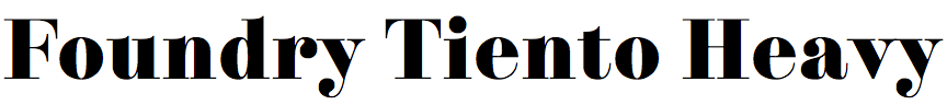
David Quay and Stuart de Rozario – Foundry Tiento (The Foundry Types)
On your website you’ve written that Foundry Tiento was inspired by Bordeaux, a very condensed Didone font David designed for Letraset in 1987. What was the design process from that earlier typeface to Foundry Tiento?
David: Ever since I drew Bordeaux it was in the back of my mind to do a wider version. Being released from the constraints of a very narrow letter I could be much more expressive and reservedly more flamboyant. I started drawing Foundry Tiento back in 2008 and it took me on and off seven years to complete it. However, although it was ready five years ago, we decided to delay the release to add about 200 further glyphs, such as small caps, inferiors, and diacritics.
Stuart: Like all of our fonts the process is still the same as it’s always been: pencil sketch, drawing, digitization, crafting, spacing/kerning refinement, and then testing, and then even more testing. After David and I re-formed I reviewed the font data, as David works in FontLab and I work in Glyphs App, and there were some technical issues still to be resolved before the final production. I went through each glyph methodically checking the weights and stems for bumps and irregularities. The process of the final font build with over 900 curvaceous glyphs to be tested was a mammoth task.
If you compare Foundry Tiento with a popular Didone, such as Linotype Didot (see differences) at first glance they’re similar, but Foundry Tiento differs in several elegant details, such as the fine spur on the ‘b’ and ‘q', the taper of the vertical of the ‘J’ and ‘j’, and the scallop on the vertical stroke of the ‘4’. What was the inspiration for these features?
David: Many of these features were already in Bordeaux, like the fine spur on the ‘b’ and ‘q’ and the expressive ‘Q’ tail. When I started working on Tiento I was teaching at Idep Barcelona, surrounded by stunning Spanish architecture, art, and musical forms. I therefore tried to infuse a Latino spirit by incorporating the dramatic Didone characteristics, letterforms, and ball terminals which are prominent in the Bodoni and Didot style from the end of the 18th and early 19th century. The other features are from my imagination; they just felt right and worked well.
I understand that Foundry Tiento is the first typeface published by The Foundry Types, formed this year as a collaboration between the two of you. Can you say anything about what you’ve got planned from the new partnership?
Stuart: Without giving away too much of our design plans for the coming year, we hope 2021 will be jam packed full of new releases. But, what I will say is, as we enter a new digital age of typography with the expanse of variable fonts, the future is leaning towards augmented and virtual reality in society, and this will offer new capabilities and dimensions not yet fully realised. These are extremely exciting times to be a type designer – so, watch this space!
![]()
![]()
![]()
Johannes Breyer and Fabian Harb – Prophet (Dinamo)
You say that your main influence for Prophet was Joseph Churchward's Georgina (not currently available as a digital typeface). Is Prophet a revival of Georgina, or was it just influenced by it?
Maybe we could say that Prophet is standing on Georgina’s shoulders? When we first learned about Churchward’s type work it was this design that immediately stood out to us. At first we simply traced it, but after testing and tweaking it for our own graphic design projects, over time the proportions became a bit more generous and its rhythm a bit more grotesk-ish. In 2015 we finally sat down with concentration, and after an intense production process a family of six weights with corresponding italics came out.
I'm finding it difficult to characterise Prophet. The characters with curves, such as the letters ‘C’, ‘G’, and ‘S’, look as if they were drawn with a broad-nib pen, like Warren Chappell’s Lydian or Tom Rickner’s Amanda. Other characters, like the ‘J’ and ‘y’, look like they are constructed from a folded strip of paper, like Hubert Jocham’s Keks. And then the characters with straight strokes, such as the ‘H’, ‘K’, and ‘M’, look like a gothic sans-serif with no contrast. What was your guiding principle in how to treat each character?
Our form vocabulary came together quite freely – wherever we saw fit we borrowed inspiration, and wherever it felt forced we just let it be. We tried to create a good mix of different characteristics, in order to not over-streamline the result. Less as a strict principle applied to each character, but more in overall atmosphere, we tried to combine a warm calligraphic tone with a clean, machine-like sensibility – bridging the hand-drawn and mechanical genres.
Although Prophet is a very readable font I’m not sure I’d expect anyone to use it for setting text. What applications did you have in mind?
We first drew Prophet to use it in our own graphic design work: mainly books and posters. But we love it when a design isn't married to just one field of usage. Of course we agree that form should follow function, but there are emotional aspects, too. The more surprisingly our typefaces are being used, the more we feel their impact, and it's great that Prophet is finding uses in a range of applications.

Ricard Garcia – Ravals (Typerepublic)
How did you get the idea of designing Ravals? And were you inspired by any earlier typefaces?
Ravals draws on many different aspects that I like about lettering, and particularly display typefaces. Since my early days drawing lettering I was fascinated by how Copperplate/Spencerian script and brush pieces created very singular and interesting connections between characters. I have always wanted to sit down and think how could I bring this sense of “uniqueness” and “fake handwriting” into a typeface versatile enough to look like a piece of lettering, whatever you may write.
Before drawing any character I spend some time realising how many variants of each character I would need. This applies not only to the typical isolated, initial, medial and final forms, but for alternative designs depending on which character they are following. Thinking about this at the beginning of the project saves you from future headaches.
Regarding inspiration, there's no particular typeface or lettering from which I took the essence of Ravals (short ascenders and descenders, black weight, upright), but those features are typical of brush lettering models from the 50’s and the 60’s. Actually, all of the social media content we create at Typerepublic is looking to that direction, referencing soul, funk, and other music from that era.
Did you sketch the font freehand with a brush first, or did you design it on the computer screen?
I usually draw a lot, and my notebooks are full of ideas and failures; however for this project I went ahead and drew directly on the computer screen. The momentum of the project was strong enough to guide the drawings of each character during the process, and this is something I kept doing until Ravals was released.
In some cases, though, I needed to think about how to integrate the uppercase set with the design of the lowercase one. For this, sketching different constructions for these uppercase characters was a helpful and fast way to see what could work and what wouldn’t, not looking for a perfect drawing but at constructions.
Some of the characters are quite individual; I’m thinking of the quiff on the ‘C’, ‘G’, and ‘6’, the curl on the ‘4’, and the vertical stroke on the ‘r'. How did you arrive at these features?
I am glad that this quiff at the top of the ‘C’, ‘G’, or ‘6’ is obvious enough for you to ask about it! The first sketches I did for these circular characters followed the single-stroke brush model. However, after seeing them in context I thought about how to make it more obvious that the shapes are drawn with a brush. This is how the tops of these characters came out, with the idea of having two strokes overlapping.
Other features designed to emphasise the idea of a brush were, for example, the entry and exit strokes as expressives in the ‘4’, ‘Z’, and ‘M’. And the thin vertical stroke in the ‘r’ is designed to create a more fluid and handwritten rhythm.
Was Ravals developed for any particular project?
Ravals is the Latin version of an Arabic typeface I designed at TypeMedia under the guidance of Kristyan Sarkis. The contrast, some of the proportions, and the weight of Ravals follows the logic of the initial Arabic typeface, based on the Ruqʿah model (informal Arabic handwriting). Hopefully the Arabic design will be released soon at Typerepublic.
![]()
![]()
![]()
![]()
Mads Wildgaard – Glossy Display and Glossy Magazine (Bold Decisions)
What gave you the idea for Glossy Display and Glossy Magazine? Were they inspired by earlier fonts?
Glossy Display started as a sketch in 2015, as an exercise in making something which had no particular function other than to look beautiful. A typeface I’d seen in passing, a headline of some old book I don’t remember any more, became the defining memory of what this typeface had to be – big counters, small ‘e’ eyes, and sharpness.
It all came together at some point in 2018 and Glossy saw its launch. Since then, reflecting back, I realise the font has been an exercise in aspects such as scaling, hinting, and then seeing how it would take on a life of its own.
It seems that Glossy Magazine is a version of Glossy Display without the fine hairline strokes, for use at smaller text sizes; was that your intention?
Yes absolutely. I had several beta-testers using Glossy Display prior to launch, and I noticed that all of them loved it for posters and covers in large type, but shied away from using it for copy. I realised I had to change something if it was to be more widely used. There’s nothing wrong with making a font that every once in a while gets used for a cover or two – covers are what people often remember something for – but if there’s substance behind the cover, then it’s just great.
It wasn’t as such a big issue to make the regular Display into Magazine, but the italic took its time. Evening out the angled serifs, while increasing the stroke width, was a time-consuming process.
I chose the name Magazine because I couldn't find a term for something in between Display and Text. Magazines often use these font sizes the rest of us find awkward for books, and so it seemed like a logical choice.
One of the most recognisable features of the fonts is the unusual overhang on the top of the ‘G’. What inspired this aspect of their design?
Oh it was definitely the first trait that I really said to myself that I wanted to become ‘Glossy’. It was so hard to find the shape. It looks excellent in front of some characters, and terrible in combination with others, but that’s okay – I can accept the user dropping a font if some letters do not fit together, because that’s after all what designing is.
The fonts look ideal for applications in magazine design and fashion marketing, and in fact Glossy Display has already been used in the French edition of Playboy magazine - see FontsInUse. Did you have these applications in mind when you designed them?
Right! Fonts quickly come into a groove of use, I find. I see recurring licensing for fashion and lifestyle, in the exact same weights and style combinations. I somehow did have this use in mind when designing the font, as it’s clear that something as sharp as this font will be used to make a distinguished design. The surprising element for me, however, was that the italic has been the most licensed of the entire family.